
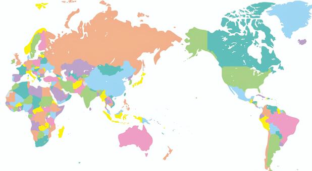
We often see maps in our daily lives, whether on paper or online using Google Maps.
Looking at a world map, the Japanese archipelago appears to be a fairly small island nation, but in reality, it ranks 61st out of 197 countries.
It’s not particularly small, and the image conveyed by maps is somewhat different.
This is because maps don’t represent the Earth’s exact land area.
Since the Earth is a sphere, it’s impossible to directly project actual distances, areas, and directions onto a flat map.
Therefore, several projection methods are used depending on the purpose of the map.
Among these, there are three main ones:
The Mercard projection, where longitude and latitude intersect at right angles and angles are correct; the Azimuthal equidistant projection, which is correct for direction and distance; and the Mollweide projection, which is correct for land and sea area.
The Mercard projection is the most commonly seen on general maps, and its characteristic feature is that areas appear larger than they actually are as latitude increases.
In other words, the closer a place is to the North or South Pole, the larger it appears on the map than it actually is.
Therefore, countries in the Arctic Circle, such as Russia, Canada, and Greenland, are greatly stretched on maps.
In reality, the United States and Canada are roughly the same size, and Russia is not even twice the size of the United States.